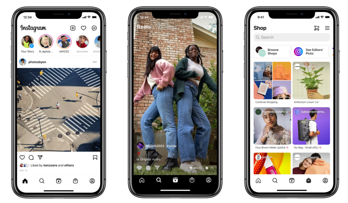
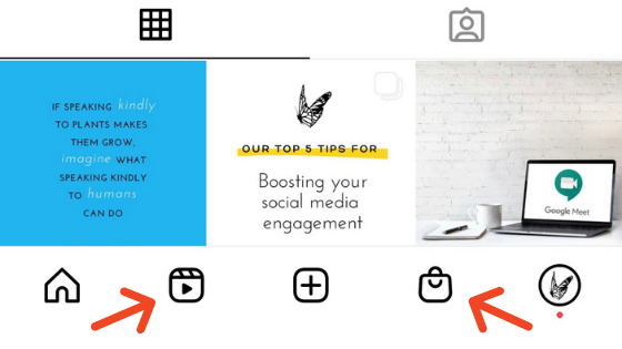
Instagram has rolled out its first major homepage redesign in years by leaning further into the TikTok-lead, short video trend and adding a new Reels tab on the home screen for all users, while also adding a Shop tab along the lower function bar to further its eCommerce push.
While the changes have brought much resistance among users, Instagram explain their reasons behind the changes.
Reels Tab
Instagram on Reels: “At Instagram, our focus has always been on young people and creators because they’re trendsetters. Change is happening quickly right now, including how both of these groups use Instagram and engage with the world. This year, with the pandemic and much of the world sheltering in place, we’ve seen an explosion in short, entertaining videos on Instagram.”
While everyone is aware that this ‘explosion’ is happening primarily on TikTok, Instagram are clearly feeling the threat of their competitors, resulting in its decision to give Reels more direct exposure on the main screen.
Instagram already added a dedicated Reels tab for users in India back in September, where TikTok remains banned, and with more Indian users looking for an alternative, Reels has become a popular option. Some users in Germany and Italy had also reported seeing a Reels tab in their IG function bar over the last few months. Clearly, those initial tests have seen positive response and increased engagement with Reels, leading to this new, broader roll-out.
Instagram chief Adam Mosseri has also told CNBC that ads are coming to Reels soon:
“I think that we can leverage the story ad format [for Reels] because it’s the same immersive experience, so that’ll be helpful because you don’t need to get advertisers to create a bunch of new creative.”
That’ll provide another option for brands to consider; if Reels does take off, that could be a good way to boost promotions, and connect with younger users in the app.
Shop Tab
Instagram’s evolving eCommerce tools will also provide new revenue opportunities in this respect, which is where the new Shop tab on the main screen also comes in.
Instagram’s been testing its Shop tab on the main function bar since July, so some users have had it in their app for a while. But now, all users will get the new, direct connection option, taking them straight through to Instagram’s evolving, in-app shopping experiences.
As explained by Instagram:
“With the Shop tab, we’re making it easy to get inspired by creators you love, shop on Instagram, and support small businesses. You can find personalised recommendations, editors’ picks curated by our @shop channel, shoppable videos, new product collections, and more.”
The tab is the latest expansion of Shops on Instagram, which will make it easier for users to essentially make one-click purchases in-app. Eventually, it will be very easy for Instagram users to simply tap on a product they like and make a purchase in-app.
Both of these additions bring significant changes and there is also a risk that Instagram is getting too cluttered, with too many options on the main screen of the app, but it seems data has suggested that despite this, if people spend more time, and eventually money, in-app, then Instagram will be onto a winner. If it can steal some audience away from TikTok as well, that further adds to the benefits.
Instagram also posted this helpful Q and A on the update to the Instagram Creators IG profile.
What do you think of the new updates? Are Instagram getting greedy? Make sure you follow our own South Coast Social page for the latest social media news


